 SupaSaaS
Features
Dashboard
SupaSaaS comes with a fully functioning dashboard that you can use to kick start development of your project.
It's fully responsive and works out of the box with some cool and handy features which you can utilize to build your project.
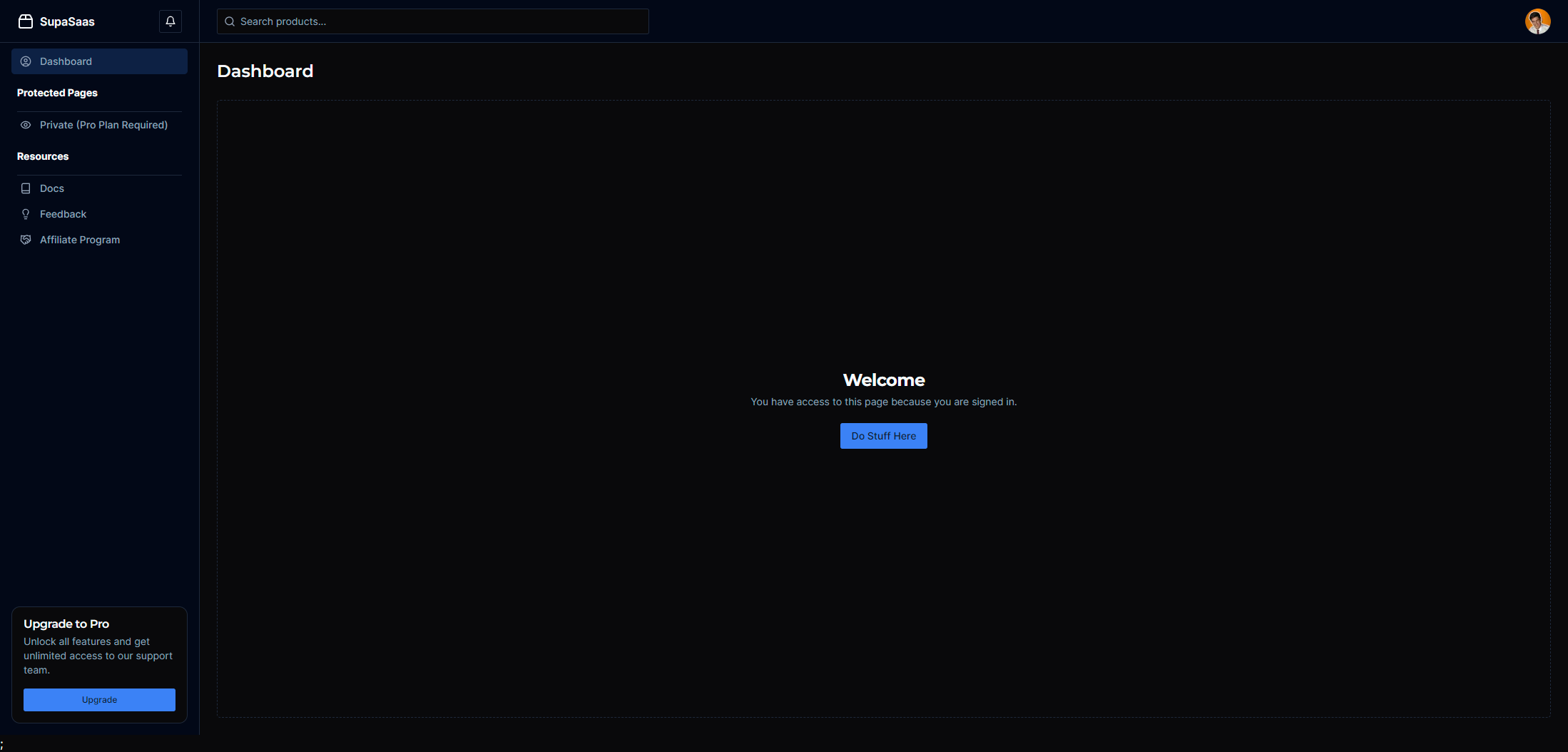
Out of the box, it's configured that any logged in user can access the main dashboard page and see their current plan status.
It also comes with a protected page which requires the user to have an active plan to access.
Protected routes
The dashboard is protected by default and requires the user to be authenticated to access it.
Please note that authenticated simply means that the user has an active session with NextAuth, not necessarily that they have specific permissions to access the dashboard. It means they're currently logged in using one of your authentication providers.
Checking for an active plan
To actually control access to particular parts of the dashboard, we can simply check to see if the user has an active plan or not using Zustand, our state manager.
Zustand is a simple and fast state management solution that allows you to manage global state in your application. It's incredibly easy to use and very lightweight.
You can use it to quickly check the planStatus of the user and then decide whether to show or hide certain parts of the dashboard.
@/components/Dashboard/Dashboard.tsx import useAuthStore from "@/store/auth-store"; const { planStatus } = useAuthStore((state) => state);
Conditional rendering
You can then use the planStatus to conditionally render parts of your app however you like.
@/components/Dashboard/Dashboard.tsx {planStatus === "active" && ( <div>Active plan</div> )} {planStatus === "trial" && ( <div>Trial plan</div> )}
Or you can use it together with NextAuth like I do, to ensure the user is logged in AND has an active plan.
@/components/Dashboard/Dashboard.tsx import { useSession } from "next-auth/react"; const { planStatus } = useAuthStore((state) => state); const { data: session } = useSession(); if (!session || status === "unauthenticated") { return <div>Not logged in</div>; } if (session && planStatus === "active") { return <div>Show dashboard here</div>; }
Sidebar menu
The dashboard comes with a sidebar that you can use to navigate between different parts of your application. It's fully responsive and works great on mobile devices by utilizing a burger menu.
You can easily customize the sidebar by adding or removing links in the @/config/routes.ts file.
Menu structure
The dashboardMenu is an array of objects that contain properties about the items you want to display in your sidebar.
The possible properties are defined by this type:
type DashboardMenuItem = {
  view: string;
  title: string;
  icon: JSX.Element | null;
  component: JSX.Element | null;
  type: "link" | "heading" | "divider" | "external-link";
  href?: string;
};
{
  view        // The name of the view to render on the dashboard
  title       // The title of the item, displayed in the sidebar
  icon        // The icon to display, use Lucide or Tabler icon components
  component   // The component to display when the link is clicked
  type        // The type of item, can be "link, heading, external-link or divider"
  href        // The href to navigate to if the type is external-link
}
Views and components
The view property is used to determine which component to render on the dashboard.
When an item is clicked, the currentPage state is updated with the view property of the clicked item.
@/components/Dashboard/Dashboard.tsx // Set the initial view to the first item in the dashboardMenu array const [currentView, setCurrentView] = useState<string>(dashboardMenu[0].view); // When a sidebar item is clicked, update the currentView state <button onClick={() => setCurrentView(item.view)}>{item.title}</button>
The component property is used to determine which component to render when the item is clicked.
@/components/Dashboard/Dashboard.tsx // Render the component based on the currentView state {dashboardMenu.map((item) => { if (item.view === currentView) { return item.component; } })}
Adding a header
You can add headers, links, external links, or dividers to the sidebar. These do not render a component when clicked, but can be used to group items together or link to external pages.
To add a header item to the sidebar, simply add the following object to the dashboardMenu array in the @/config/routes.ts file.
If you are not rendering a component when an item is clicked, simply leave the view property empty.
@/config/routes.ts  {
    view: "",                   // Leave empty
    title: "Protected Pages",   // The title of the heading
    icon: null,
    component: null,            // We are not rendering a component, just the title.
    type: "heading",
  },
Adding a divider
To add a divider to the sidebar, simply add the following object to the dashboardMenu array in the @/config/routes.ts file.
@/config/routes.ts  {
    view: "",           // Leave empty
    title: "divider",   // The title of the heading
    icon: null,
    component: null,    // We are not rendering a component, just the title.
    type: "divider",
  },
Adding a link to dashboard page
To add a link to the sidebar, simply add the following object to the dashboardMenu array in the @/config/routes.ts file.
@/config/routes.ts { view: "/dashboard", title: "Dashboard", icon: <Eye className="size-4" />, component: <ProtectedView />, type: "link", }
When this item is clicked, the ProtectedView component will be rendered on the dashboard.
Adding an external link
To add an external link to the sidebar, simply add the following object to the dashboardMenu array in the @/config/routes.ts file.
@/config/routes.ts { view: "", // Leave empty title: "Google", // The name of the link icon: <ExternalLink className="size-4" />, // The icon to display, use Lucide or Tabler icon components component: null, // We are not rendering a component, just the title. type: "external-link", href: "https://google.com", // The href to navigate to if the type is external-link }
When this item is clicked, the user will be redirected to https://google.com.
User profile
The dashboard also comes with a dropdown user profile section that you can use to display information about the currently logged in user.
Currently, it includes the users email address and plan name. It also includes links to their billing portal and the ability to log out.
You can easily customize this section by adding or removing items in the @/config/userMenu.ts file.
Billing portal
The billing portal is a protected route that requires the user to have an active session and an active monthly subscription plan to access.
If the customer has access to the dashboard via a one-time based plan, they will not be able to access the billing portal since they don't require one.